|
Pitch and Color Recognition |
|
|
|
Sound and light both exhibit oscillatory wavelike characteristics with various frequencies, wavelengths, and amplitudes. Both are detectable by normal human senses (hearing and sight) within a suitable range of frequencies by means of sense organs (eyes and ears) specifically adapted for these purposes, both propagate at a finite speed, both exhibit Doppler shifts toward higher frequencies when the source of the wave is approaching us, and for both kinds of waves the sensed intensity is dependent on the amplitude of the wave. Despite these similarities, there are several very significant physical differences between light and sound. Most notably, accoustical waves propagate only in a material medium, whereas electromagnetic waves propagate through vacuum. Also, sound waves consist of pressure fluctuations parallel to the direction of propagation (so they are called longitudinal waves), whereas light waves consist of electric and magnetic fluctuations perpendicular to the direction of propagation (so they are called transverse waves). The transverse nature of electromagnetic waves accounts for the phenomenon of polarization, which has no counterpart in purely longitudinal waves. |
|
|
|
Furthermore, the frequencies of visible light and audible sound differ from each other by more than ten orders of magnitude. The frequency range of audible accoustic sensation through our ears is roughly from 20 Hz to 20,000 Hz, whereas the frequency range of visible optical sensation through our eyes is roughly from 380 trillion Hz to 760 trillion Hz. Arguably our physio-muscular imaginations can conceive of something cycling 200 times a second, but the frequencies of light are far outside any macroscopic physiological processes we can viscerally imagine. It’s also worth noting that while the frequency range of audible sound covers a factor of 1000, (about 10 octaves), the range of visible light covers only a factor of 2 (just one octave). |
|
|
|
The differences between our mechanisms of perception of sight and sound are also quite striking. For example, although there is a rough analogy between the pitch of a sound wave and the color of a light wave (since both are related to the frequency of the wave), our perceptual mechanisms for discerning pitch and color are very different. Most people are capable of distinguishing two different accoustical tones, and deciding which of them has the higher frequency, but almost no one can hear an isolated tone and identify its absolute frequency in terms of the corresponding musical note. (This ability is called perfect absolute pitch, and is extremely rare, even among trained musicians). In contrast, nearly everyone has perfect “absolute pitch” for optical frequencies, in the sense that we can be shown a red object and identify it as red, without the need to compare it with any reference color. In other words, we aren’t limited to making comparative evaluations of light frequencies, we experience each color as an absolutely identifiable sensation, with no direction sensation of higher or lower light frequencies. If people are asked whether red has a higher or a lower frequency than blue, they probably don’t know (indeed they might guess red, because red seems like a “hotter” color), and yet they can very accurately recognize red and blue as absolute sensations. |
|
|
|
This is not to deny that our perception of color is influenced by the context. Experiments have shown that, to some degree, our optical processing compensates for variations in the illumination applied to familiar scenes. For example, if we are very familiar with the sight of a red apple next to a green leaf in full daylight, and if we then view this scene in the orange glow of a sunset, both the apple and the leaf reflect different absolute spectra, but to some extent our visual processing infers the shift in illumination and compensates for it, so that we still perceive the apple as red and the leaf as green, even though their spectra at sunset are quite different from their spectra at noon. It’s tempting to make an analogy with how we recognize a familiar melody played in a different key, but in the case of color perception we are not shifting the whole frequencies, we are filtering out a common spectral component from all the elements of a scene. This process of compensation is an important part of the stability of our color perceptions of physical objects, and it obviously relies not just on raw sensory perception, but also memorys of past perceptions. |
|
|
|
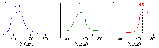
Of course, it’s not strictly accurate to say that colors correspond to frequencies, because most perceived colors actually represent a continuous spectral density profile with non-zero energy over the entire range of visible frequencies, as shown below for typical profiles doe light that is perceived as the colors blue, green, and red. |
|
|
|
|
|
|
|
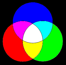
These three colors constitute an effective basis for many other colors of visible light, meaning that many (though not all) other color sensations can be induced by some linear combination of these three. By superimposing all of them in equal amounts we get a spectral profile with energy distributed more or less uniformly over the whole visible spectrum, so it is perceived as white light. Other combinations give different color perceptions, as indicated by the figure below. |
|
|
|
|
|
|
|
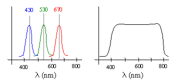
As the above plots show, the spectral density profiles we perceive as pure colors are not, in general, monochromatic. A monochromatic wave has all of its energy concentrated at just a single frequency and wavelength. (In practice it’s impossible to produce a perfectly monochromatic beam of light, but we can come very close.) The dominant wavelengths associated with common sources of blue, green, and red light are 430, 530, and 670 nanometers respectively. Monochromatic light of these frequencies induces the sensations of blue, green and red, even though they don’t have the full spectral densities of typical light with those colors. Moreover, experiments have shown that if we combine three monochromatic beams with those frequencies, the result is perceived as white, even though the energy is not uniformly distributed. Thus, both of the spectral distributions shown below are perceived by our eyes as “white light”. |
|
|
|
|
|
|
|
The psychological impression of other monochromatic colors, such as yellow (590 nm), can be produced by mixing various amounts of the three “primary” colors. For example, the sensation of pure yellow can be matched by superimposing pure red and pure green, even though this superposition is not “actually” monochromatic yellow. |
|
|
|
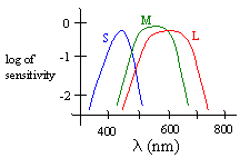
There is a surprising lack of consensus as to precisely how color is perceived and interpreted, but it is well established that our eyes contain an imaging surface with a large number of discrete receptors (cones and rods). The perception of color is facilitated mainly by the cones. The most popular theory of color perception dates back to the early 1800s, when Thomas Young showed that most perceived colors can be generated by a linear combination of just the three colors red, green, and blue. From this Young conjectured that they human eye contains just three kinds of detectors. Sure enough, over a century later (in 1965) it was confirmed that there are basically just three kinds of cones in the retina of the eye (in primates), designated as S, M, and L to signify whether they are sensitive to short, medium, or long wavelengths. The peak sensitivities for these three types of cones are at wavelengths of about 440, 545, and 565 nm respectively, although the sensitivity profiles of the three types of cones are fairly broad and overlap each other, as shown below. |
|
|
|
|
|
|
|
This helps to account for our optical “absolute pitch”, because the three types of cones are effectively “tuned” to respond to certain absolute frequencies. Thus the signals sent to the brain do not consist of raw amplitudes in time, nor even of frequencies, but simply of the degrees to which each of the three types of cones have been stimulated. As a result, although we have no sense of frequency of optical waves, we can recognize absolutely a range of frequencies (and mixtures) based on the excitation states of the S, M, and L cones. It follows that our sense of color is essentially three-dimensional, i.e., every color we perceive corresponds to some combination of three scalars, representing the degree to which each of the three types of cones is being excited. |
|
|
|
Given any arbitrary spectral density profile C(l) we can determine three scalars s,m,l representing the degrees to which this profile stimulates the three different kinds of sensors (cones) by evaluating the integrals |
|
|
|
|
|
|
|
This is a crude form of spectral analysis. Clearly there is more information in the continuous function C(l) than in the three numbers sC, mC, and lC, so in general there are infinitely many different spectral density profiles that yield the same set of s,m,l values. Two spectral density profiles that induce the same color sensation are called metamers. |
|
|
|
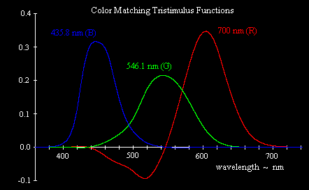
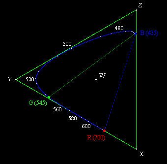
In the 1920s, prior to the determination of the actual absorption characteristics of the cones in the human eye, a series of experiments was conducted to determine what combinations of extreme monochromatic red, green, and blue light (taken as light with wavelengths 700, 546.1, and 435.8 nm respectively) produced the visual sensation of monochromatic light for each other frequency. It became apparent that some frequencies cannot be matched with any positive combination of these three primaries, but it is possible to match all the frequencies if we allow combinations with two of the primaries contributing positively and the third contributing negatively. A negative contribution for one of the primaries means that the primary is added to the sample (i.e., added to the color we are trying to match), and then the resulting color can be matched by a positive mixture of the other two primaries. The results of these color matching experiments, giving the relative amounts of the three primary monochromatic stimuli necessary to match monochromatic light of each wavelength in the visible range, are shown below. |
|
|
|
|
|
|
|
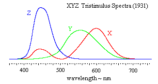
Strictly speaking, one of the primaries is negative and the other two are positive at each frequency, but the most notable negative contribution is for the red primary in the blue-green range near 500 nm. (For a more detailed explanation of this, see Color Space, Physical Space, and Fourier Transforms.) Now, it’s conceivable that the L (“red”) cones in our retinas might somehow transmit “negative” values when subjected to certain stimuli, but a more likely explanation is that the rather arbitrary choice of basis stimuli (i.e., monochromatic lights with wavelengths of 700.0, 546.1, and 435.8 nm) made by the experimenters in the 1920s do not actually match the absorption spectra of the three types of cones. It’s possible to convert these results to some other basis, such that the entire range of color sensations can be matched by a positive linear combination of the basis stimuli. In 1931 an international committee defined such a basis, and it has remained in use ever since. Instead of taking the three monochromatic light signals R,G,B as the basis colors, the committee defined a basis consisting of three “imaginary” primaries, denoted by X,Y,Z, each of which is a linear combination of the R,G,B primaries. The committee also wanted the X,Y,Z primaries to be scaled in proportion to optical luminance rather than in proportion to intensity (energy), so they first made the conversion |
|
|
|
|
|
|
|
to account for the fact that a given amount of energy yields different degrees of luminance depending on the frequency. (Green is the most luminous color per unit energy.) Then they defined the X,Y,Z spectra as linear combinations of the R, G, and B luminances by the relations |
|
|
|
|
|
|
|
Notice that the Y primary is simply the sum of the luminances of the three constituient beams of monochromatic light, and since luminance is additive, it follows that Y is numerically equal to the total luminance of the combination. Now, if we consolidate the above linear transformation with the re-scaling from intensity to luminance, we get the following overall transformation from the R,G,B primaries in units of intensity to the X,Y,Z primaries in units of luminance: |
|
|
|
|
|
|
|
Applying this transformation to the R,G,B color matching results shown in the previous plot, we get the equivalent color matching results expressed in terms of the imaginary primaries X,Y,Z shown below. |
|
|
|
|
|
|
|
The eigenvalues of the transformation are 2.07812, 5.22590, and 5.67870, and the corresponding eigenvectors (normalized to unit magnitude) are |
|
|
|
|
|
|
|
The third eigenvector is essentially the “white” point, i.e., an equal amount of the three primaries, so this means the transformation maps the white point of (RGB)I to the white point of (XYZ)L. The inverse transformation is |
|
|
|
|
|
|
|
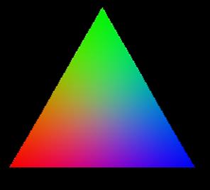
Since the triples X,Y,Z signify only the ratios of the three primaries in the mixture, it is usually more convenient to work in terms of parameters x,y,z which are proportional the X,Y,Z but normalized so that x + y + z = 1. Then the three-dimensional space reduces to a two-dimensional projective plane as shown below. |
|
|
|
|
|
|
|
If we plot each point on the triangular plane surface, using its coordinates to determine the intensity of the respective basis color at that point, we get the image shown below. |
|
|
|
|
|
|
|
The geometric center of this triangle has equal amounts of blue, green, and red, so it is gray, whereas each of the three vertices is purely blue, green, or red. Incidentally, it’s worth noting that although we associate the L cones with the color red, the peak absorption wavelength of the L cones is actually near monochromatic yellow. However, at that wavelength there is also significant absorption of the M cones. The sensation of red is associated not only with a high level of excitation of the L cones, but also with a low excitation of the M (and S) cones, consistent with the fact that the wavelength of spectral red is 670 nm, where both the M and S cone absorption levels are virtually zero. |
|
|
|
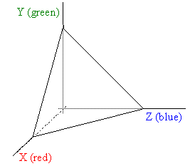
The locus of pure monochromatic light can be plotted on the chromatic triangle, as shown by the solid blue curve in the figure below. |
|
|
|
|
|
|
|
Most of the visible spectrum is contained between the wavelengths from 435 nm to 700 nm, so these were originally taken as the B and R primaries by the CIE committee in 1931. For the third primary, denoted by G, they selected 545 nm, evidently because all the spectral colors between 545 nm and 700 nm can be matched almost exactly by just a positive linear combination of these two wavelengths (although strictly speaking a very slight negative B contribution is needed in this range). Also, the non-spectral colors interpolated between R and B can obviously between matched by a positive combination of those two primaries. However, the spectral colors between B and G cannot be matched without a significant negative R contribution. All of this is made obvious by the figure above. If we selected a “G” primary of 520 nm instead of 545 nm we would reduce the amount of negative red required to match the spectral colors from G to B, but we would also then require a significant amount of negative blue to match the spectral colors between G and R. Clearly there are no three spectral colors that will enable us to match all the other spectral colors by purely positive combinations. (Using four spectral colors, such as Red, Yellow, Green, Blue, we can achieve more coverage, but still cannot represent all visible colors with strictly positive combinations.) |
|
|
|
To find a set of three primary stimuli that can give all spectral colors (and therefore all positive combinations of spectral colors) by purely positive combinations, the CIE committee chose the three imaginary “colors” represented in the above figure by the points X, Y, and Z. These are outside the locus of spectral colors, so they do not represent actual visible colors, but they give the minimal triangular envelope enclosing all the visible colors. |
|
|
|
Given the smallness of these wavelengths and the slight variations between one color and the next, it’s remarkable that the tuning works so well, and is so uniformly accurate over our central field of vision. (Color perception is much less accute in our periferal vision, where rods predominate over cones.) It has been reported that humans can distinguish wavelength differences as small as 0.2 nano-meters. How is it that “red” receptors in one region of our retinas are so perfectly correlated with “red” receptors in other regions of our retinas, and from one eye to the other? And how is it that this tuning remains stable and accurate for decades, and in all different temperatures? It seems clear that psychological compensation processes (like the process to compensate for different illuminants) must be involved. |
|
|
|
If our ears contained just a few individual sensing elements, each tuned to one particular absolute frequency, we might all be able to recognize the absolute “color” of audible tones just as well as we can recognize absolute red. However, the ear needs to respond over a much larger range of frequencies, and the dimensionality of the “space” of audible sensation is much greater, i.e., we can distinguish a much greater variety of spectral characteristics of sound than we can of light. Roughly speaking, the coiled cochlea of the human ear has a varying elasticity along its length, so it can be regarded as a series of oscillators of different resonant frequencies, and these perform a fairly detailed spectral analysis of incoming sound waves, transmitting to the brain something a 3000 point spectral profile. The detailed mechanics of how the cochlea responds to stimuli are very complicated, and the study of this function is hampered by the fact that the mechanical properties change significantly if a cochlea is removed for study. Nevertheless, it seems clear that whereas the spectral analysis of optical stimuli has only three dimensions, the spectral analysis of aural stimuli has at least 3000 dimensions. It is not surprising that we (most of us) don’t memorize the absolute sensations associated with tones over ten octaves. Instead, perhaps to for more efficient processing, we rely on relative memories of frequencies. The rarity of perfect absolute pitch may also be due partly to a greater variability in the resonance characteristics of our aural sense organs than of our optical sense organs, whose reception frequencies are determined by fundamental atomic absorption properties of certain specific molecules. In contrast, the frequencies of the cochlea are determined by the fluid pressure in the inner ear, and many other factors that could be sensitive to temperature, humidity, barometric pressure, and so on. |
|
|
|
The color sensation resulting from a combination of blue and red in equal measures is called magenta or purple. Not surprisingly, there is no such thing as monochromatic purple, because this color sensation results from the superposition of two frequencies at opposite ends of the visible spectrum. No single frequency will excite both the S cones and the L cones (except at very low levels), because the absorption spectra of those cones do not overlap very much. This accounts for our ability to conceive of a cycle of colors (a “color wheel”) even though the underlying phenomenon is a linear sequence of frequencies. If we naively believed colors mapped directly to frequencies, the existence of a cycle of colors would be paradoxical. The resolution of the paradox is that the “fictitious” color we call purple effectively “wraps around” from the high-frequency to the low-frequency end of the optical spectrum, enabling us to conceive of the color spectrum as a closed loop. |
|
|
|
Incidentally, the color purple has an interesting history, partly due to the fact that although purple occurs often in nature, it is (or was) very difficult to produce a practical purple dye. The ancient Phoenicians were the first to discover a way of producing a purple dye, but it was very expensive, and could be afforded only by the royal family. For this reason the color purple became associated with royalty, and it was declared illegal for anyone other than royalty to wear purple. The Romans adopted this tradition, so it was illegal in ancient Rome for anyone other than the Emperor and his family to wear purple. Not until 1856 was an inexpensive way to produce purple (actually, mauve) dye discovered. (It was found accidentally by an 18-year-old English chemist named William Perkins while he was trying to discover a way of synthesizing quinine from coal tar.) Wearing purple became very popular for awhile, until the novelty wore off, and people realized that purple really doesn’t look very good on clothes anyway. |
|
|
|
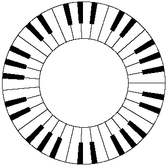
Just as we can conceive of a cycle of colors, there are also cycles with regard to accoustical pitch, but the basis for these cycles is completely different than for the cycle of colors. We do not have a fictitious pitch sensation (like an audible purple) to wrap around from the high to low end of the audible spectrum. If there were such a thing, we might conceive of a sonic wheel of tones as illustrated by the hypothetical piano keyboard below. |
|
|
|
|
|
|
|
Instead of this, sense of the “cycle” of audible tones is based on the harmonic relations modulo the octave. We associate each tone with its “equivalent” in other octaves. Since the range of audible frequencies covers ten octaves, each tone has ten audible “equivalents”. Placing the frequencies on a logarithmic basis, each octave is subdivided into the twelve tones of our traditional musical scale (so the frequency of each semi-tone differs from that of its neighbors by the factor 21/12), and then we place all the tones into equivalence classes modulo twelve (i.e., modulo one octave). It’s possible, by combining tones into a sequence of chords, to create the impression of an endlessly rising (or falling) loop. For example, there is a piano exercise consisting of a melodic line that leads naturally to a repetition of itself, but shifted four semi-tones higher in pitch. Thus if we begin on the key C, the second verse is “identical” but begins on the key E, and the third verse is identical but begins on the key G#. If we go one step further we are back at C, exactly one octave higher than we began. If this verse is played in both octaves, it almost imperceptibly shifts back down to the original pitch, so we have an infinitely rising cycle. |
|
|
|
It’s interesting that our optical senses cover almost exactly one octave, from 380 trillion Hz for the lowest red to 760 trillion Hz for the highest violet. If the color sensing elements in our eyes were analagous to strings with tensions and lengths tuned to certain frequencies, we might speculate that the red sensors would also have some propensity to absorb energy in the extreme blue/violet range, just as a string has a second energy mode at twice the base frequency. Of course, cones are not strings, but even in terms of the excitation levels of atoms we find simple arithemtic sequences of preferred energy levels, e.g., the Balmer and Lyman series for the absorption and emission frequencies of hydrogen atoms. However, these kinds of series do not generally favor frequencies rations of 2 to 1, so apparently the musical octave analogy is not valid for our sense of color. Nevertheless, it so happens that the “red” cones in our eyes actually do have a secondary response characteristic in the extreme blue end of the spectrum, which accounts for why violet is perceived to have a reddish tint. This is discussed further in Color Space, Physical Space, and Fourier Transforms. This wrap-around characteristic of the red cones contributes to our sense of a cycle (rather than a linear sequence) of colors. |
|
|
|
|
|
|